Yamaha - Siren Connected Boat App

🔒 Confidential Case Study Notice:
This case study is shared strictly for interview and evaluation purposes. It is protected under NDA and contains work done for Yamaha, Siren Marine and KDDI via Station Digital Media. Please do not reproduce, share, or distribute this content outside the hiring process. For access, a password is required and provided upon request. Thank you for respecting the confidentiality of this project.
Our client, Yamaha, has engaged us to merge their two apps, namely Siren Marine and Yamaha Outboards apps, into a single application named "Siren Connected Boat" (referred to as "One App" for simplicity). This unified app will be available for both iOS and Android platforms, as well as for smartwatches.
This project is substantial, as the One App could enable users to add boats, outboards, and connect with Yamaha's Siren Device, offering remote control capabilities to boat owners. In addition to these features, the One App will encompass various other functions, including geofencing, maintenance assistance, the ability to add secondary users to the boat, and more.
The development process was divided into five sprints, covering the entire app creation journey. I joined the project starting from Sprint 2 and remained involved until the app's completion. During this time, I contributed to several core features such as Siren Sensor Details, Siren Settings, Add Products, Secondary User Management, and certain aspects of Account Settings.
We have successfully crafted a demo app for the client's review, resulting in their high satisfaction with the final outcome. The development process involved a number of iterative design phases to refine the app's functionality. The anticipated release for the app is scheduled on both the Apple Store and Google Play App Store in February 2024.
Client
Yamaha
Team
Stakeholder -Yamaha (20+), Business analysis team (8), development team (20+), design team (4)
Role
UI/UX product designer
Motion graphic designer
Tools
Figma, Jira, Adobe Creative Suite, Microsoft Office 365
Location
Long Beach, California & Remote
Duration
Full-time
2. 2023 - 5. 2024


Siren Sensor Tile Details & Siren Settings
Teams: business analysis team, development team & UI/UX designer Sophie
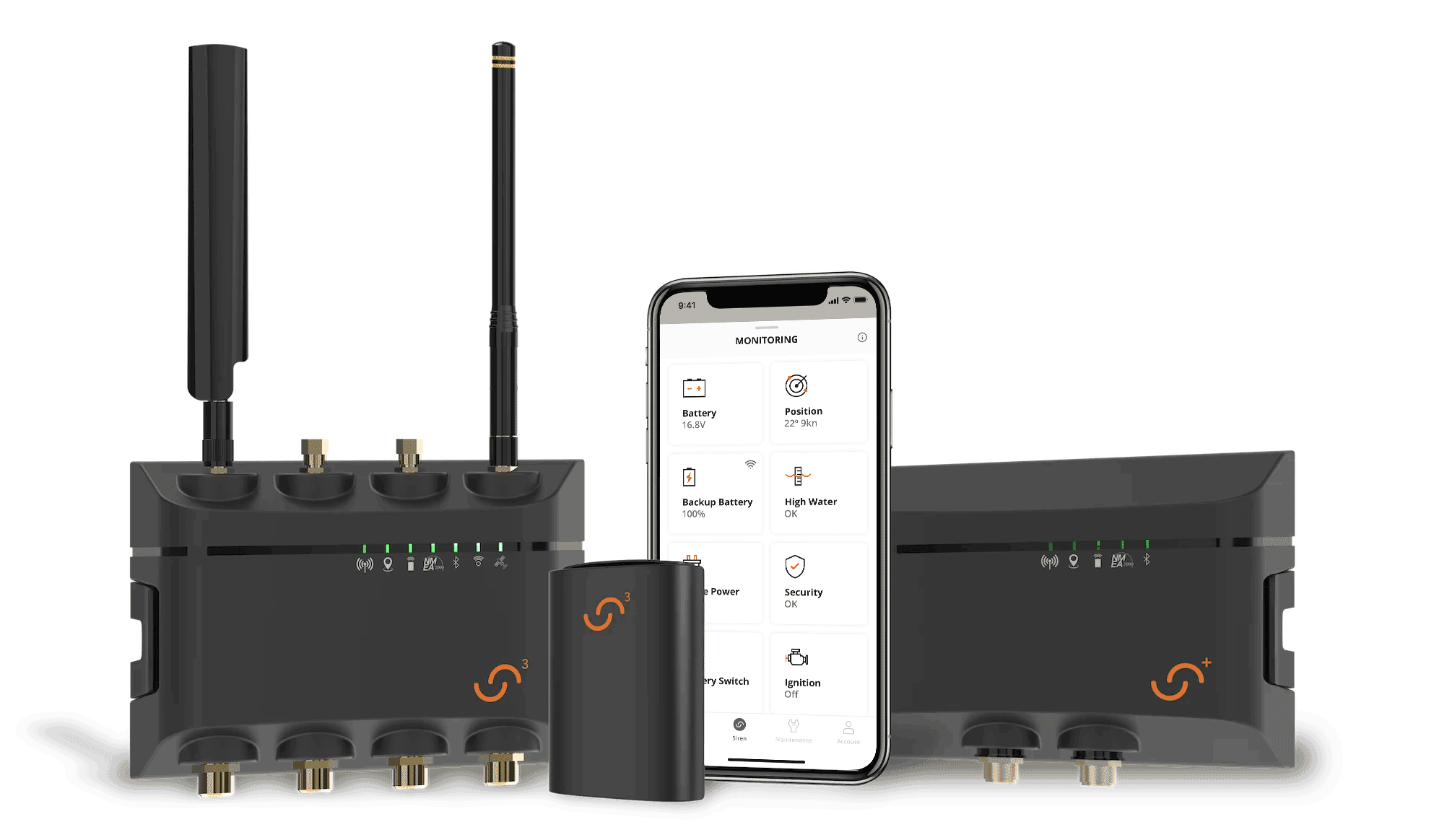
What's Siren Marine Sensors?
Siren Marine Sensors' Smart Boat Monitoring System puts your boat in the palm of your hand 24/7. With add-on wireless and wired sensors, your Connected Boat® system can be expanded for even more robust monitoring, tracking, and security.
I'm proud to have designed the core features of Siren Sensor Details and Siren Settings for their new One App.
Goal & Challenge
-
The goal was to simplify Siren Sensor Tile Details and Siren Settings.
-
The challenge was to combine certain settings from Siren Sensor Tile Details and Siren Settings. The previous app settings were fragmented and complex for users to navigate. Following the revision, users can now conveniently edit crucial settings all in one place.
Siren Sensor Tile Details Reskin
Requirements
We have received a file named "Siren Sensor Tile Details Breakdown" from the old app. This file has been extremely helpful in helping me understand the functions. This understanding will be crucial as we work on reskinning the app for a more user-friendly design. An example is provided below:

Old and New Design Comparisons
Here are a few examples of old and new design comparisons with pain points and solutions below.
Note: Click on the image or arrow to view it in a larger size or to see more slides below.


Add Products
Teams: business analysis team, development team & UI/UX designer Jonas & Sophie
Goal & Challenge
-
The goal was to design an easy, smooth and user friendly "Add Products" user flow, including a siren device and outboards, covering all error cases and edge cases.
-
The challenge:
Since the Yamaha team wanted to combine both of their apps (SirenMarine app & Yamaha Outboards app) into one app (Connected Boat app), it requires the app to be able to add both Siren devices and outboards, which introduces many scenarios and edge cases.
Based on our research, users can add products from two entrances: the Home screen and the Account screen. Therefore, we explored 6 scenarios.
-
Add Siren device from Home
-
Add Outboards from Home
-
Add Siren device for the first time from Account
-
Add Siren device with/without boats from Account
-
Add outboards for the first time from Account
-
Add outboards with/without boats from Account

Old App Designs
Below are a couple of screenshots of the "Add Product" flow from the old Sirne Marine app and the "Add Outboard" flow from the Yamaha Outboard app. My challenge is to combine both flows into one app.
Old Siren Marine App - Part of Add Product Flow

Yamaha Outboard App - Part of Add Outboard Flow

The old apps belonged to Yamaha Company, but they had two different design styles, making them appear as if they were developed by two distinct companies. Specifically, the Yamaha Outboard App included a technical outboard flow that was challenging for non-experts in boating to comprehend. Our objective is to merge and redesign the product's flow to be user-friendly and easily understandable. We aim to enable users to navigate through all the steps seamlessly, incorporating excellent branding design.
Add products Procedures
Business analysis team and design team reviewed the current Siren Marine app and Yamaha Outboards app to analyze the process of adding products. Following this, BA team confirmed the procedures with the Yamaha team. The design team then developed hi-fi UI design and user flows based on these procedures.

Scenario 1: Add Siren Device From Home
Based on the current app research and add product procedures list, I have created a quick user flow by Draw.io.

I have created a detailed hi-fi UI user flow, including edge cases and error cases based on the user flow.
Note: Click on the image or arrow to view a larger size or more options below.


Scenario 2: Add Yamaha Outboards From Home
Based on the current app research and add product procedures list, I have created a quick user flow by Draw.io.

I have created a detailed hi-fi UI user flow, including edge cases and error cases based on the user flow.
Note: Click on the image or arrow to view it in a larger size or to see more slides below.


Scenario 3: Add Siren device for the first time from Account
Based on the previous 2 scenarios, the BA team has created the UI transition diagram, along with Yamaha team's requests (I also included my notes in the requests), for me to reference and create the user flow.
Note: Click on the image or arrow to view it in a larger size or to see more slides below.


Below is the user flow I have created, which also includes edge cases and error cases.
Note: Click on the image to view it in a larger size.

Scenario 4: Add Siren device with/without boats from Account
Based on the previous 3 scenarios, the BA team has created the UI transition diagram for me to reference and create the user flow.
Note: Click on the image to view it in a larger size.

Below is the user flow I have created, which also includes edge cases and error cases.
Note: Click on the image to view it in a larger size.

Scenario 5: Add outboards for the first time from Account
Based on the previous scenarios, the BA team has created the UI transition diagram (I also included my notes in the requests), for me to reference and create the user flow.
Note: Click on the image or arrow to view it in a larger size or to see more slides below.


Below is the user flow I have created, which also includes edge cases and error cases.
Note: Click on the image to view it in a larger size.

Scenario 6: Add outboards with/without boats from Account
Based on the previous scenarios, the BA team has created the UI transition diagram for me to reference and create the user flow.
Note: Click on the image to view it in a larger size.

Below is the user flow I have created, which also includes edge cases and error cases.
Note: Click on the image to view it in a larger size.

Secondary User Management
Teams: business analysis team, development team & UI/UX designer Sophie
Goal & Challenge
-
The goal was to simplify the process of adding a secondary user and to address all the edge cases and error scenarios that may arise during the process.
-
The challenge was to reduce the permissions of secondary users. Yamaha initially wanted to grant numerous permissions to secondary users, but this would have led to various technical issues for the dev team. Ultimately, we decided to limit most of the permissions, which also makes it easier for the owner to manage the account.
Requirements & User Flows
The BA team analyzed the requirements from the Yamaha team for me to design the hi-fi UI user flows. After revising the design a couple of times, we reduced the permissions of secondary users and confirmed with the Yamaha team at the end.
Note: Click on the image to view it in a larger size.

Boat Owner's View
Here is the user flow, including edge cases and error scenarios, for the owner's view when adding a secondary user.
Note: Click on the image to view it in a larger size.

Secondary User's View
Here is the user flow, including edge cases for the secondary user's view when receiving, accepting, or rejecting an invitation from the boat owner.
Note: Click on the image or arrow to view it in a larger size or to see more slides below.


Account Settings
Teams: business analysis team, development team & UI/UX designer Sophie
Goal & Challenge
-
The goal was to simplify the Account settings and make the design intuitive and user-friendly. The account settings reskin was very straightforward. For this case study, I showcased two important and unique features: Alert Recipients and Float Plan.
-
The challenge was to prioritize and organize the settings and finalize which settings belong to Account and which settings belong to Siren Settings, while also addressing all the edge cases.
Alert Recipient
Requirements
The Alert Recipient feature has been relocated from the General Settings to the Siren Settings section within the Account Settings. This move was made because users can only set an Alert Recipient if they have a Siren device. The account owner can add alert recipients and receive alerts via email, text, or both.Below are the requirements from Yamaha, along with my questions and answers from the BA team, along with the old design.
Pain Points of Old Design
-
There was no hierarchy under Alert Recipients Setting.
-
It's hard to remember who was "Alert Recipient 1" or "Alert Recipient 2".
-
The app user have to re-enter email & phone number again.
-
It's unnecessary to ask user to receive alert notification.
-
"Delete Alert Recipient" didn't look like a button.
Note: Click on the image to view it in a larger size.

Solutions
-
Add "+" icon to distinguish between "Add Alert Recipient" and "Added Alert Recipient".
Display user's contact information for quick scanning on the "Alert Recipient" screen. -
Users can customize recipients' names for better recognition.
-
Pre-populate the app owner's information without requiring re-entry (users can still edit it).
-
Removed the setting that asks users to receive alert notifications.
-
Added "Delete" and "Save" buttons on the details screen. Users can also delete from the "Alert Recipient" list for quick removal. The app owner can't delete the owner's information for security reasons.
Final User Flow
Here is the user flow, including edge cases.
Note: Click on the image or arrow to view it in a larger size or to see more slides below.


Float Plan
Requirements
The float plan needs to be simplified and easy to maintain compared to the old Yamaha Outboard app. Below are the features of the old Yamaha Outboard app, the requirements from Yamaha that the BA team has analyzed, and my notes.
Pain Points of Old Design
The old design looked nice, but it's kind of overwhelmed by many functions and taps.
-
It's confusing regarding the link "View More", and it's also distracting to view trip information.
-
There was no hierarchy, making it hard to read.
-
There were too many question icons, which were unnecessary.
-
There was no back/delete button, impacting many screens.
-
Based on app reviews and user feedback, "Resources" and "Checklist" are less frequently used and more time-consuming to navigate.
Note: Click on the image to view it in a larger size.

Solutions
-
Removed unnecessary links to focus on trip plan information without distraction.
-
Resolved hierarchy issues by changing different font sizes, colors, and volumes.
-
Removed all question/info icons to keep the screen easy to read and intuitive.
-
Added CTA buttons and swipe right behavior. For example, there are a couple of ways to delete passengers or itineraries, which makes it easy for users to interact with the feature quickly.
-
Removed "Resources" and "Checklist" from the Float Plan to keep the feature simple and quick to add/edit/delete based on user review and feedback.
Final User Flow
Here is the user flow, including edge cases.
Note: Click on the image or arrow to view it in a larger size or to see more slides below.


Wear OS
Teams: business analysis team, development team & UI/UX designer Sophie
Goal & Challenge
-
The goal was to simplify the mobile app features and resize them for smartwatch use.
-
The challenges:
-
To resize all features and prioritize core features for smartwatch design.
-
All user cases were considered when designing for the smartwatch.
-
Research about WatchOS and Wear OS design guidelines and thinking about compatibility while designing for Wear OS.
-
User Cases and Features
The BA team listed all features from the mobile app for the design team to brainstorm. We conducted a small internal team vote (involving 7 people) to determine which features users would like to have on the smartwatch. As a result, Boat Info, Location/Geofence, and Maintenance emerged as the most important features. Inbox was deemed the least important feature, but the Yamaha team insisted on including Inbox and Promo in the smartwatch app design for business promotion purposes. Below is the top feature list:
-
Boat Info, Location/Geofence & Maintenance
-
Monitoring & Commands
-
Arm Mode & Sentinel Mode
-
Inbox / Notifications
-
Promo
Note: Click on the image to view it in a larger size.

Design Style Research
The next step was to research smartwatch design, which involved studying competitors' smartwatch apps and trending app designs. I conducted research on both WatchOS and Wear OS designs. However, I focused primarily on Wear OS design research since I was responsible for designing for WatchOS.
Additionally, I thoroughly reviewed all WatchOS guidelines on the Android Developers site to stay updated on the latest updates to the WatchOS system design style guide, which also for dev team to note.
Note: Click on the image to view it in a larger size.

Design Options
Based on all the research and design references, I have created four design options.
-
Options 1 & 2 were based on the Wear OS design style but did not fit well on the WatchOS screen.
-
Options 3 & 4 were based on the mobile app Home design style to keep both the boat view and map view on the Home screen, which fit well on the WatchOS screen.
As a result, the Yamaha team chose option 3 but removed the boat view on Home screen; however, they still needed revisions.
Note: Click on the image to view it in a larger size.

Design Iteration
I have completed 4 more rounds of design iteration based on option 3, which were reviewed by the design director, BA team, dev team, and lastly, the Yamaha team.
Below are the 3 rounds of Wear OS designs.
Note: Click on the image or arrow to view it in a larger size or to see more slides below.


Final Design
Below is the final design. Added full map view, included different user cases, edge cases and alert states.
Note: Click on the image to view it in a larger size.


Design Library
UI/UX designers Greg & Sophie
The design library for the mobile app is extensive because Yamaha has multiple products to include in the app, which involve various user cases and white labels, necessitating the ability to switch between different boats and boat brands. Additionally, we need to distribute the design library to the Yamaha marketing team for creating design guides and branding purposes.
Motion Graphic Design
UI/UX designers Sophie
There were a few animations needed in the app. I have created animations for the Splash and Login screens, loading animation, and product instruction tutorial motion graphics with After Effects.
Note: Click on the image or arrow to view it in a larger size or to see more slides below.


Design QA
UI/UX designer Sophie
In the past, we used PowerPoint to conduct design QA, which was time-consuming and also difficult to avoid duplicated issues. For Yamaha design QA, I conducted it on Jira, which was much easier to manage, organize, and check issues, especially when teams needed to search for specific issues on Jira. However, not many people are familiar with how to use Jira. Therefore, I have created a Design QA Guideline on Figma for the whole team to refer to.
Jira Tickets Creation
Since we designed for cross-platform apps, we needed to QA on different devices. So, I discussed with the BA team and created design QA tickets categorized by iOS mobile & smartwatch, and Android mobile & smartwatch. Then, I broke down the QA tickets by features to avoid duplicate issues. Designers can create 'Child tickets' for the issues under the corresponding feature on Jira. Below is the Jira ticket breakdown.
Note: Click on the image to view it in a larger size.

Review & Improve
What to Improve
I understand that Station Digital Media has a tight schedule with Yamaha's project, but it's important to use UX design methods like user-centered design to create user-friendly apps. I would conduct many usability tests and A/B testing with primary and secondary stakeholders if possible.
I would also improve the design library. The current design library has too many headers, pop-ups, and the same icons with different sizes, etc. I would reduce the number of components and combine similar ones for easier updating in the near future.
Below are some of my suggestions for some of the features:
Home
-
Remove the boat view; it's kind of useless to display the boat view on the Home screen. Users already know what their boat looks like (the boat view was Yamaha team's requirement).
-
The boat name is too big, and it's hard to tell that it's the boat name. I'd like to decrease the font size and place the boat name outside of the box. Users can switch boats/products with just one tap instead of having to go to the menu.
-
The "View all" button is not specific enough. It's better to indicate what item to view, like "View more monitorings."
-
The outboard card is confusing. Users have to guess what the numbers and letters mean. It's better to include a subtitle to explain and to reduce the size of the outboard graphics, which takes too much space on the card.


Account
-
I would separate Product Management from Account. Product Management is an important feature of the app. Currently, users have to click deeply to access important features like Siren device settings and outboard settings. Moving Product Management to the Menu or Bottom Nav Bar would be better. Then move Account from the Bottom Nav Bar to the Menu.
-
Also, separate App Settings from Account. It's not related to Account. Move App Settings to the Menu.
Your Products
-
Changing the wording to "My Products" makes the user feel more personally connected to the app.
-
It's hard to discern this information. There are too many different font styles. The boat name is too large, especially in cases where the user gives the boat a long name. I'd suggest adding subtitles to explain the meaning of each string.
-
It's confusing to have these two text buttons on the card, especially since the card is tappable. It's also easy to tap on the wrong tabs. I would suggest removing these two text buttons. Instead, display what kinds of products are included in the boat card for quick scanning by the users, such as Siren device and outboard information.


Float Plan
-
It doesn't make sense to allow the user to manually input the number of passengers if the number of passengers added does not match the input. Instead, I would automatically adjust the number to synchronize with the total number of passengers added.
Siren Settings
-
Currently, we use navy blue for uneditable input strings, but it's confusing to me. I would remove the input line to indicate to the user that these strings are uneditable.

Review
Our client, the Yamaha team, is very pleased with the apps we designed and developed. It's a huge innovation to combine their two apps (Yamaha Outboard app and Siren Sensor app) into one comprehensive app. They held an app launch party in Miami, Florida, on the launch day, February 15th, 2024. The Yamaha team also signed a new contract to continue collaborating with us!

Our customers aren't really happy with the new app updates, and there are a few of main reasons, including what I mentioned earlier in "What to Improve":
-
The average age of most boat owners is 54, making them slow to adopt new technologies.
-
There is no user-centered design at Station Digital Media company. The company prioritizes clients and signs contracts with tight schedules, leaving insufficient time for usability tests or user research during the design process.
-
Since the app users are older people, it's better to prioritize accessibility design for the app.
To improve app usability, our team made a couple of updates based on customer reviews. As a result, the review scores have increased from 2.1 to 3.3 on the Apple Store and from 2.0 to 2.5 on the Google Play Store.
🔒 Confidential Case Study Notice:
This portfolio piece is password-protected to respect confidentiality agreements and client privacy. It's shared solely for evaluation during the hiring process. Thank you for keeping this content private and secure.