Isuzu EV Fleet Management
🔒 Confidential Case Study Notice:
This case study is shared strictly for interview and evaluation purposes. It is protected under NDA and contains work done for Isuzu and KDDI via Station Digital Media. Please do not reproduce, share, or distribute this content outside the hiring process. For access, a password is required and provided upon request. Thank you for respecting the confidentiality of this project.
As the lead UI/UX product designer for this project, I designed the Isuzu360 EV Operations Platform—a comprehensive enterprise system supporting electric vehicle (EV) fleet managers. The platform consists of three distinct portals:
-
Fleet Overview Portal
-
VIN-specific Performance Tracking Portal
-
Isuzu-only Internal Admin Portal
Each portal features rich data visualizations and insights into driving behavior, charging patterns, route history, vehicle management, and report notifications—empowering Isuzu to monitor and optimize EV fleet performance at scale.
The project was driven by Isuzu’s vision to evolve beyond static reporting into a dynamic, Google Analytics-style experience with customizable charts and improved search and filtering workflows. These enhancements aimed to deliver actionable insights and faster decision-making for Isuzu’s operational teams.
The work spanned two major phases from April to June 2025, building on Station Digital Media’s original Kintaro-based platform design that I created in 2024. My contributions focused on translating complex data into intuitive user flows, establishing reusable components, and delivering a cohesive, scalable design system—positioning Isuzu to meet future operational challenges in their global EV fleet management.
TL;DR / Executive Summary
3 Scalable, Data-Driven Portals
I designed and delivered three distinct, enterprise-grade EV fleet portals (VIN View, Fleet View, Isuzu Admin) for Isuzu, translating dense spreadsheet data into intuitive, role-based insights—on time and beyond client expectations.
Strategic Impact & ROI
My work directly contributed to the client extending the contract for Phase 3, showcasing how clear, actionable dashboards can drive smarter operational decisions and secure long-term partnerships.
Senior-Level Collaboration & Handoff
I led the full UI/UX effort across two project phases, collaborating with PM, BA, and dev teams to ensure technical feasibility and stakeholder alignment. I created dedicated handoff files for both clients and developers, ensuring seamless implementation.
Atomic Design & Future-Ready Systems
Using Atomic Design principles and Lean UX, I built a robust, flexible design system that supports ongoing updates, adapts to future features, and maintains clarity even in data-heavy environments.
Accessible & Intuitive for All Users
Throughout, I prioritized visual clarity and usability for mid-aged and older stakeholders—ensuring that every interaction, from route history to fleet group edits, was easy to understand and act upon.
Client
Isuzu
Team
Stakeholder - Isuzu Team, Station Team:Project Manager (1), Product Manager (1), Business analysis (1), Design Team (2),
Location
Long Beach, CA
Role
Lead UI/UX product designer
Tools
Figma, Jira, Adobe Creative Suite, Microsoft 365
Duration
Full-time
3.18 - 6.16.2025

Workflow Breakdown
Click on each card to view the details of each section


Laying the Groundwork
Teams: Project managers, BA team & design manager Jonas, UI/UX product designer Sophie
Goals
Redefine how fleet managers and internal admins interact with EV data—moving away from static, outdated dashboards to a dynamic, modular platform with rich insights and a clean, modern feel.
Challenges
-
No direct user interviews—everything was based on data from Excel sheets provided by the BA team.
-
The original Station Digital Media's platform Kintaro-based system was clunky and visually dated.
-
The PM and BA team only shared the high-level vision (“like Google Analytics”) and data definitions in Excel, without explicit task flows or UX goals.
-
Frequent updates to the Excel data sheet meant shifting chart requirements and layout considerations.
Solutions
-
I dove into the Excel files to understand the data structure and context, while also pulling up Google Analytics dashboards as visual references to inform a modular, chart-based layout.
-
The client also provided some old chart samples they had, which I used to quickly sketch layout ideas.
-
Since there were no detailed user tasks or interactions shared, I used a mix of Google Search and ChatGPT to explore best practices for displaying each data type—making sure each metric (like route history, SOC, regenerative energy) had a clear visual presence in the dashboard.
-
With each round of updated data sheets from the client, I refined the layouts and updated components in the design system, keeping the interface consistent and ready for quick iteration.
-
We set up two phases to tackle the work incrementally: Phase 1 for core dashboards and search, Phase 2 for advanced features—this helped keep the scope realistic and achievable.
-
Lean UX mindset: Designed iteratively and visually-first, prioritizing what would help Isuzu’s teams see and use the data more effectively.
Schedule
Here’s the most up-to-date schedule for the cross-functional team and stakeholders. I was involved from the initial design phase all the way through to final testing (highlighted in yellow).

Original Information Architectures
Note: Click on the image or arrow to view it in a larger size or to see more slides below.


Background on the Original Design Work
In 2024, I designed these three portals—Fleet Overview, VIN-specific performance tracking, and the Isuzu-only internal admin view—based on Station Digital Media’s Kintaro platform. I transitioned the design system from Sketch to Figma, rebuilding and refining the component library to support more consistent and flexible iterations. The final designs included a full reskin of the Kintaro-based portals to align with Isuzu’s branding and meet initial stakeholder needs.
After a year of real-world use, the Isuzu client recognized opportunities to make the portals even more powerful and user-friendly. They decided to invest in a major enhancement initiative to level up the platform’s data visualization, search/filter capabilities, and overall experience. My original designs set a strong foundation for this next phase of improvements.
This groundwork from 2024 gave me a head start for the 2025 redesign efforts, allowing me to reuse and enhance what was already in place, while also making it easier to pivot quickly based on new client insights.


Requirements & Enhancements During Workshop
The PM and BA team worked directly with stakeholders and the client to finalize the Excel sheets during the workshop, which became our main data and content reference for designing the three portals. These sheets were updated multiple times during the design phase. Whenever there were changes, I’d either create new components or tweak existing ones in the design system (access password: xing) to ensure quick updates and keep the overall design consistent.
Note: Click on the image or arrow to view it in a larger size or to see more slides below.


References
We received clear references from the client to design the charts in a Google Analytics-style layout, along with a few specific chart examples they wanted me to consider. To make sure I was presenting the data accurately and effectively, I synced up with the BA team to fully understand each chart’s purpose and functionality. I also used ChatGPT and Google Search to research best practices for each chart type, making sure every metric from the Excel data was translated into a clear, actionable visual in the dashboards.
Note: Click on the image or arrow to view it in a larger size or to see more slides below.


Competitor Research
Some of the data from the Excel sheets was so complex that even the PM and BA team didn’t fully understand how it should be visualized. They asked me to design these charts using my best judgment, with an emphasis on clarity and visual impact for the initial client concept.
To bridge that gap, I conducted competitor research on similar data charts—exploring how other companies translated dense datasets into clear, actionable insights. I focused on:
-
What patterns and visual frameworks competitors used to highlight key data
-
How they balanced data density with readability
-
Which features or chart interactions seemed to be most valuable to users
-
Gaps or weaknesses I could improve upon in my own designs
This analysis helped me identify the most critical data points and the most effective ways to present them—blending clarity, purpose, and consistency across the entire Isuzu360 EV Operations Platform.
Below are some competitor dashboards and charts that informed my approach and inspired my final visual direction.
Note: Click on the image or arrow to view it in a larger size or to see more slides below.


Updated Information Architecture
Based on requirements and research insights, I implemented Report Settings across both Fleet View and VIN View portals, enhanced the Vehicle List, and introduced a Vehicle Group Management feature within the Fleet View portal.
Note: Click on the image or arrow to view it in a larger size or to see more slides below.


Wireframe
The client wanted to see if we could squeeze in a lot of complex data charts—like a Google Analytics dashboard—to help them visualize dense EV data more effectively. So, I quickly whipped up a wireframe for the VIN View Dashboard, reusing elements from the original design I created back in 2024. This wireframe was purely a feasibility check—showing how multiple data panels and charts could coexist in a clean, user-friendly layout.
When I shared it with the client, they loved it. That early visualization gave them the confidence to greenlight enhancements across all three portals, and it set the stage for the next phase of detailed, high-fidelity design work.
Note: Click on the image to view it in a larger size.

Phase 1: Dashboard & Search Enhancement
Teams: Project manager, BA team & UI/UX product designer Sophie
Goal
Deliver a cohesive, modular dashboard experience that supports 2/3-chart/widgets layouts, improved filtering/search (especially for the Isuzu-only admin portal), and sets a scalable design foundation.
Challenges
-
Heavy data density (needed to avoid overwhelming users)
-
Limited time to test ideas—needed rapid internal validation
-
Existing Kintaro design had clunky interactions, no flexibility for multi-chart views
Solutions
-
Atomic Design Approach: Created reusable UI components—charts, cards, data tables—to ensure consistency and faster iteration.
-
Enhanced Isuzu-only portal search and filter UX for more precise admin data exploration.
-
Used Visual Benchmarking (Google Analytics dashboards, modern SaaS admin portals) to guide data visualization patterns.
-
Dev & Stakeholder Sync: 3–4 handoff updates weekly, ensuring rapid iterations based on BA feedback.

Design Process
1. VIN View & Fleet View First Design Draft
For Phase 1 of this project, I kicked things off by turning a rough wireframe—crafted to see if we could fit dense, Google Analytics-style charts—into a fully-fledged, modular VIN View dashboard. Using that as the foundation, I brought in Isuzu’s brand colors to shift the visuals away from the original Kintaro look, making sure everything felt tailored for Isuzu’s identity and real-world enterprise needs.
I didn’t stop there. Once the VIN View was locked down with the design manager, PD and BA team, I immediately tackled the Fleet View portal, applying the same modular system to keep everything consistent. I had hoped to get early dev feedback on the VIN View alone, but with the dev team based in Nanjing, the PD and BA pushed me to finalize both VIN and Fleet designs first. So, I powered through, wrapped up the entire design system update in Figma, and delivered both portals in two days—ensuring everything was consistent, scalable, and dev-ready for the next phase.
This workflow wasn’t just about cranking out screens; it was about rapidly adapting to new inputs, aligning design with real-world constraints, and balancing visual clarity with the dense data Isuzu needed to see. Below is the first design draft of the VIN View and Fleet View that I created before presenting it to the client.
Note: Click on the image or arrow to view it in a larger size or to see more slides below.


2. Isuzu-Only Search & Filter Enhancements
While the internal team was reviewing the initial designs, I took the opportunity to reimagine the search and filter functionality to be more robust, accurate, and user-friendly. In the previous design, users could filter by date, company, enrollment status, year of manufacture, and registration status. However, there was significant room for improvement.
The enhanced design introduced several key improvements:
-
VIN & Email Search: Users can now search by VIN number or email, with the flexibility to select individual, multiple, or all entries.
-
Company Filter Refinement: The company filter now supports selection of specific VINs associated with that company, offering even more granular control (again, with options for select all, single, or multiple).
-
Bulk Vehicle Selection & Action: Previously, viewing all vehicles was cumbersome—now users can easily select all and view them in a single, seamless experience.
Throughout several design iterations, I restructured the filters into a more streamlined and powerful tool:
-
General Search Bar: I added a prominent, general search bar beneath all filters, which made it easier for users to find exactly what they need.
-
Filter Layout Optimization: Given the new functionality, the filter section grew to three lines. To keep the page clean and avoid overwhelming the user, I introduced an expand/collapse toggle for the filter area.
-
Navigation Refinements: Recognizing the importance of the Client Insights page, I moved it to the main left menu for quicker access and better discoverability. I also removed the breadcrumb bar to reduce clutter and improve focus.
-
Brand Alignment: I updated the styling to align with Isuzu’s visual brand, ensuring a cohesive experience across all portals.
Here’s a comparison of the before-and-after designs and enhanced user flow, showing how these enhancements created a more powerful and intuitive interface for the Isuzu internal team.
Note: Click on the image or arrow to view it in a larger size or to see more slides below.


3. Final Enhancement of Phase 1
After reviewing the design draft, the PD and BA team decided to add more widgets to the VIN View dashboard: Charging Data Total and Route History. They provided me with references for these new widgets, which I used to ensure the additions aligned seamlessly with the existing dashboard design. These updates further enhanced the portal’s data visualization and provided fleet managers with a more complete picture of each vehicle’s performance and usage.

In addition to the new widgets, the PD and BA team also requested that I design an “edit mode” feature for the dashboard, enabling users to add, remove, or reorder widgets. Knowing that our primary stakeholders are mid-aged and elderly fleet managers, I wanted to ensure the edit mode would be extremely intuitive and visually easy to grasp. To guide my design, I conducted a quick competitor research on editing dashboard experiences—looking for best practices that balance flexibility with clear interaction cues. This competitor research helped me identify the most user-friendly patterns for editing dashboards, which I then adapted into a quick draft of the edit mode for the Isuzu360 VIN View and Fleet View portals.

For the final Phase 1 design, I added new functions just for the VIN View portal, since the Fleet View didn’t need to show charging data or route history (aside from the new dashboard edit mode). Because vehicles might travel to multiple places in a day, I designed two Route History scenarios—single route and multiple routes—to make sure everything was clear and easy to use. Once the PM and BA teams signed off, the design was ready for dev handoff, setting us up nicely for Phase 2.
Note: Click on the image or arrow to view it in a larger size or to see more slides below.


Phase 2: Advanced Features & Scalability
Teams: Project manager, BA team & Design Manager Jonas, UI/UX product designer Sophie
Goal
Expand the platform’s capabilities with:
-
Route history maps enhancement and vehicle management workflows for VIN View.
-
Fleet location map (showing up to 100 vehicles as the client required) and Group Management for Fleet View.
-
Report notification settings and widget zoom features—tailored for the different user roles across both VIN and Fleet Views.
Challenges
-
Making sure all these new features didn’t clutter or overwhelm the dashboards.
-
No direct user testing—had to rely on data mapping and BA team’s scenarios to figure out the right flow.
-
Addressing BA team’s request to add “stop points” on route history maps, which turned out to be technically unrealistic (more on that below!).
-
Maintaining clean, visually intuitive admin workflows with all these data-heavy updates.
Solutions
-
Route History Clarifications: The BA team initially asked to add “stop points” to the route history, but after some digging and real talk with the dev team, we realized it was just not possible. Why? Because stop points would log every single stop—stop signs, red lights, gas breaks, and even lunch breaks—which would clutter the data. Unless the trucks had advanced sensors like boats (Siren Sensors) or GPS tech that could tell real stops from temporary ones, adding stop points wasn’t feasible or useful. So I left those out and explained it clearly to the PD, BA, and dev teams—no confusion, no wasted effort.
-
Fleet Location Map Pivot: Originally, the client wanted to show up to 100 vehicles live on the Fleet Location map. I designed a sample version, but later dev confirmed it wasn’t possible technically because of real-time constraints. So I revised the feature to display Fleet History instead—showing the routes of up to 100 vehicles instead of their live locations. That tweak kept things realistic and still gave the client what they needed!
-
Date Picker Enhancement: The client wanted a date picker on every widget for quick checks—beyond the main dashboard’s date dropdown. Using a competitor example for reference, I designed them to align with the existing design system and meet accessibility standards. Since it introduced complex scenarios for daily, weekly, or monthly views, I synced with the team to nail down logic and ensure everything stayed user-friendly.
-
Accessibility & Usability: Knowing that most stakeholders were mid-aged or older, I designed for easier interactions: maps that can be enlarged, widgets that can be zoomed or full-screened, and clear, readable data layouts.
-
Report Notifications & Customization: The client also wanted a very flexible report notification system—so I iterated multiple times on the UI to let users easily pick different dates, times, and fleet groups to receive emailed reports.
-
Design Method: Kept things data-driven. I took the Excel data and competitor insights, translated them into actionable user flows and clean visual structures, and iterated quickly to stay aligned with the dev and BA teams.
Design Process
1. Route History Clarifications (VIN View)
The route history feature was a particularly tricky part of this phase. Depending on the date and time the user selected, the data scenarios could change quite a bit, which required careful planning and visualization. However, there were gaps in how the BA team and our design team understood what “route history” should really look like. For example, the BA team asked if we could include “stop points” in the route history—like every time a vehicle paused, even briefly.
To clarify whether that was useful or even feasible, I dug deeper. Recording every single stop would capture things like stop signs, red lights, lunch breaks, or getting gas—cluttering the dashboard with too much noise that doesn’t help with decision-making. Unless the EVs had GPS sensors that could differentiate real stops from temporary pauses (like Siren Sensors for boats), it just wasn’t practical.
I explained this to the PD, BA team, and dev team, and everyone agreed. The dev team also confirmed they couldn’t technically capture those tiny stop points anyway—route data was only recorded every 24 hours, so showing every single pause would be more confusing than helpful.
To make sure I wasn’t missing anything, I even checked in with ChatGPT for an extra perspective. It confirmed what I’d found: micro-stops are usually noise, not useful data. In modern dashboards, the smart approach is to filter out these minor pauses and focus only on meaningful stops—like delivery points or charging stations. That insight validated our decision to skip stop points entirely and keep the data clean and actionable.
So in the end, I kept the route history simple and focused—no unnecessary clutter, just clear, useful data for real operational insights.
Note: Click on the image to view it in a larger size.

2. Fleet Location Map Pivot (Fleet View)
Originally, the client wanted to display up to 100 vehicles live on the Fleet Location map and specifically asked to enlarge the map view since the primary stakeholders are mostly middle-aged and older users. To address this, I designed two layout options:
Option 1: A large map view with the vehicle list displayed underneath, ensuring the map takes center stage while the list remains easily accessible.
Option 2: A side-by-side layout, placing the map and list next to each other for easier cross-referencing without any eye-jumping. This layout offers a more user-friendly experience, especially for users who want to quickly compare the list and map at a glance. At the end, Option 2 was chosen.
Note: Click on the image to view it in a larger size.

Fleet Location to Fleet History – Final Implementation
But later on, the dev team confirmed that showing up to 100 live vehicle locations wasn’t technically feasible because of real-time data limitations. So, I pivoted to display Fleet History instead—mapping out the routes of up to 100 vehicles based on the selected date rather than live tracking. This change kept the feature realistic and still delivered what the client needed.
In the final design, clicking on any vehicle from the list updates the map to highlight that vehicle’s route history for the chosen timeframe. I also added a detailed section below the map to show route-specific data. Since the primary stakeholders are mid-aged and older, I made sure the map and route lines were enlarged and easy to read, ensuring the layout was accessible and perfectly contained within one screen—no extra scrolling required.
Note: Click on the image to view it in a larger size.

3. Date Picker Enhancement
The client wanted each widget to have its own date picker for quick, on-the-fly data checks—even though there was already a date dropdown at the dashboard level. They shared a competitor’s example, which helped guide the approach.

To keep things consistent and ensure accessibility, I designed the date picker components in line with the existing design system, using larger touch targets and high-contrast visual cues. But adding a secondary date selection layer opened up a lot of possible scenarios—like different dropdown states depending on whether the time range was a day, week, or month. So, I had a few meetings with the cross-functional team to make sure we nailed down the logic and functionality in a way that was both intuitive and inclusive for all end users.
Note: Click on the image to view it in a larger size.

4. Accessibility & Usability
Since many of the stakeholders are mid-aged or older, I made sure the design was highly accessible and easy to navigate. In addition to enlarging the fleet map and adding date pickers to each widget, I implemented features that make interactions easier—like zoomable and full-screen widgets with clear, high-contrast layouts to ensure data is readable at a glance.
The client also asked for a scenario where the Route History map would display 10 vehicle routes. To support that, I designed the zoomed-in behavior and confirmed with the dev team that this functionality was feasible. We had several sync-ups to make sure it would work smoothly.
For date and time flexibility, we held a session with the dev team to finalize the different time-based report scenarios. For example, if a user wants to see data for a single day, the charts would automatically adjust their timeline to show hour-based or minute-based data, depending on how granular the report needed to be. This logic ensures that even detailed time selections still display in a clean, user-friendly way—without overwhelming the viewer.
Note: Click on the image or arrow to view it in a larger size or to see more slides below.


Since the project required scenarios for minute-based and hour-based data, I also refined the date dropdown to include start and end time fields. Drawing on past project references, I optimized this experience to make it more user-friendly and intuitive.
Note: Click on the image to view it in a larger size.

The dev team shared that they couldn’t technically support the 4-data Overall Performance widget from Phase 1, so the PD and BA teams decided to switch it to a KPI Comparison widget for both phases. This new widget allows users to select two KPIs and compare them directly on one chart.

Initially, I thought a single dropdown to choose two KPIs might work, but the dev team said it wasn’t technically feasible. So I switched to a two-dropdown approach and designed the user flow to clearly show how to select and compare data. This helped the client and dev team understand how to implement and use the feature effectively.
Note: Click on the image or arrow to view it in a larger size or to see more slides below.


Another scenario revolved around the info icon and chart widget tooltips. For week, month, and year reports, the tooltips display only datestamps, while day or past-hour views show timestamps for more precise tracking. I also designed a few different layout variations for the info icon tooltip to help the client and dev team understand how these tooltips would look and behave, ensuring a consistent and intuitive user experience.
Note: Click on the image to view it in a larger size.

5. Report Notifications & Customization
The client wanted a flexible and user-friendly report notification system, so I iterated multiple times on the UI to let users customize everything: dates, times, KPIs, and recipient emails—both for the VIN View and Fleet View portals. I also designed the report email template for easy reference by the client and dev team.


Note: Click on the image to view it in a larger size.

Later, the client requested even more control: the ability to add different fleet groups and create customized reports for each one. This added complexity, but I tackled it by mapping out all the possible scenarios and building detailed user flows to keep things clear and intuitive. The end result? A robust notification system that’s easy to interact with, meets all the client’s needs, and got great feedback from the team!
Note: Click on the image to view it in a larger size.


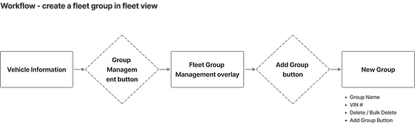
Since the Report Notification Settings allowed for adding fleet groups, I designed the Fleet Group Management flow within the Vehicle Information page for the Fleet View Portal. Users can easily add multiple vehicles to different groups and edit them directly in the Vehicle Information interface. The flow also lets users quickly add, edit, or delete groups as needed, ensuring a seamless and user-friendly experience tailored to the client’s needs. I worked closely with the cross-functional teams to align the user flow and design logic, and the client had no questions or concerns—it pretty much covered all possible use cases and scenarios.
Note: Click on the image or arrow to view it in a larger size or to see more slides below.


5. Design Method
I kept the process data-driven—starting with a deep analysis of Excel datasets and competitor insights, which I then translated into clear, actionable user flows and intuitive visual structures. I rapidly iterated based on feedback from the development and business analyst teams, ensuring the designs remained aligned with technical feasibility and business goals.
To support collaboration, I created separate client handoff and developer handoff files in Figma, in addition to the main working file. Each was clearly organized with labeled pages by phase and date, allowing feedback and updates to be tracked independently. This structure helped reduce miscommunication and made handoffs more efficient.
We also held weekly sync-up meetings with cross-functional teams. These sessions were used to address developer questions, confirm client requirements, and clarify design intent. Below is an example of one of our meeting tracking sheets:
Note: Click on the image to view it in a larger size.

Throughout all workflows, I emphasized usability and accessibility for mid-age and elder stakeholders, while maintaining visual clarity and feature parity in every scenario.
Outcome & Impact
UI/UX product designer Sophie
-
Successfully delivered three distinct, scalable portals across two phases—on time and beyond client expectations.
-
The client was so impressed with the results that they extended the contract for Phase 3.
-
Designed a robust, flexible system that’s ready to scale and adapt to future feature updates and requests.
-
Showcased the power of turning dense, complex data into clear, actionable dashboards—no direct user research needed.
-
Every detail, from flexible fleet group management to route history scenarios, was thoughtfully aligned with client goals and cross-functional team needs, ensuring a smooth rollout and confident handoff.
Below, you can view the working files of the three portals (password: xing):
By the way, here’s the generic loading animation I created in After Effects. For the developer handoff, I broke it into three separate pieces so the dev team can easily adjust the loading sequence on each page. This also helps reduce loading time since smaller pieces load faster and are easier to manage.

Reflection & Senior-Level Takeaways
UI/UX product designer Sophie
This project really challenged me to turn dense, spreadsheet-heavy data into clear, role-specific insights that actually help people get their jobs done. By combining Lean UX, Atomic Design, and data-driven task flows, I was able to deliver dashboards that were not just visually polished, but also practical and intuitive for real-world use—especially for an audience of mid-age and older stakeholders. Every interaction, from editing fleet groups to checking vehicle route histories, was carefully designed for clarity, accessibility, and scalability. It’s proof that even without direct user testing, you can create a product that feels thoughtful, deliberate, and genuinely helpful.
What to Improve
If I had more time and resources, I would have:
-
Conducted direct user testing or at least stakeholder interviews to validate the flow and features early on—especially for critical admin tasks.
-
Explored adding a small, shared design system library (with tokens, states, and interaction rules) to help future designers and developers move even faster.
-
Considered a more modular approach for complex scenarios like multiple date-based reports or dynamic fleet maps, which might need even more flexibility as the platform grows.
Overall, this project was a great opportunity to push clarity and consistency in a fast-paced, data-heavy environment—and I’m excited to carry those lessons forward!
Design System
UI/UX product designer Sophie
Here’s a look at the Isuzu Design Library I built to support the project. It’s a centralized hub of all reusable components, visual styles, and interaction patterns—ensuring consistency across the VIN View, Fleet View, and Report Notification portals. By sharing this Figma file with the client and dev team, we aligned on a scalable, data-driven design system that streamlined handoff and future updates.
Password: xing
🔒 Confidential Case Study Notice:
This portfolio piece is password-protected to respect confidentiality agreements and client privacy. It's shared solely for evaluation during the hiring process. Thank you for keeping this content private and secure.